In the world of hockey, sweaters have always been a key part of a team’s identity. From classic designs to downright awful ones, the colors and patterns of a team’s jersey can evoke strong emotions from fans. Today, we take a look at the best and worst sweaters in the history of the Arizona Coyotes.
Despite the Coyotes currently being inactive, their sweater game has always been strong. Throughout their tenure, the team has consistently looked good on the ice, even amidst the chaos surrounding the franchise.
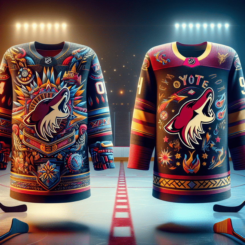
The iconic Kachina sweaters, based on the supernatural beings in Pueblo beliefs, bookended the Coyotes’ time in Arizona. These jerseys were a rare bright spot for the franchise, with both the black and white versions being fan favorites. While it’s sad to see these jerseys put on hold, bringing them back should be a top priority if hockey ever returns to the valley.
The team’s last alternates, designed by Rhuigi Villaseñor of Rhude, blended modern colors with classic Kachina touches. These sweaters were a hit among fans, adding a fresh twist to the Coyotes’ look while paying homage to their past.
According to the NHL Uniform Database, there were some subtle yet significant details on these alternates. “The captain patch is the team’s half-moon logo which forms the letter ‘C,’ and the alternate patch is of what looks like two cacti kissing, forming the letter ‘A.'” Despite their short lifespan, these designs are truly underrated in the world of hockey fashion.
In conclusion, the Arizona Coyotes have had their fair share of highs and lows when it comes to sweaters. From the iconic Kachina jerseys to the modern alternates, the team’s wardrobe has always been a talking point. Hopefully, whenever the Coyotes make their return, they’ll bring back some of these classic designs that fans have come to love and cherish.


